
Tips & Guides
5 Tips for Optimizing Your Donation Form
A well-crafted donation form is key to maximizing contributions and building relationships with donors. The best forms are simple, streamlined, and visually aligned with your brand.
It can feel challenging to balance that simplicity with all the details you may want to collect from donors, but making your form as user-friendly as possible will lead to a higher donor conversion rate.
Our Customer Success team put together some practical tips to help you optimize your donation form and create a seamless donation experience. Pledge It’s donation forms are designed with these key elements in mind, whether you’re crafting an embedded form for your website or a unique donation form for your next fundraising initiative, capital campaign, or giving day.
1. Simplify, Simplify, Simplify
The shorter and more straightforward your donation form, the better. Only ask for essential information—this reduces friction and helps donors complete the process quickly. This doesn’t mean you can’t ask additional questions, but consider the ease and speed at which donors can fill them out, and if those questions are truly necessary or just something you’re curious to know.
2. Inspire Action with a Powerful Headline
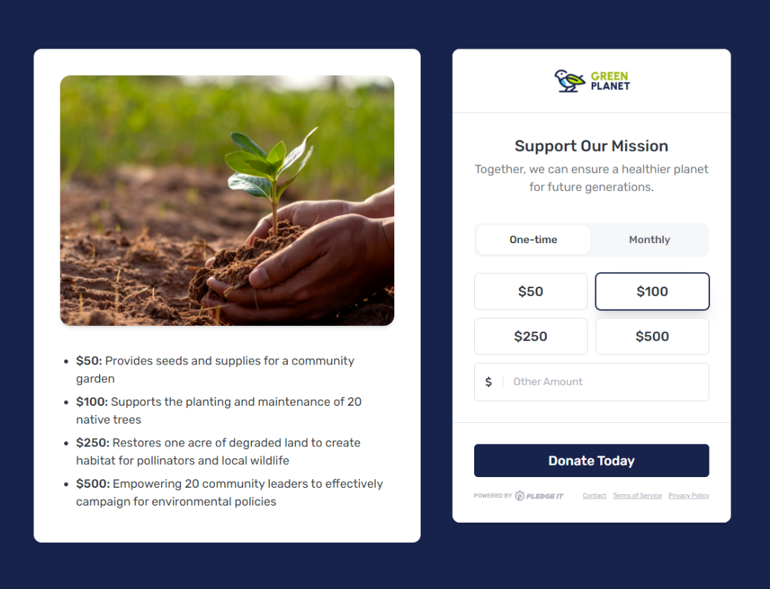
Use a bold headline and motivating call-to-action that reminds donors of the importance of their gift. Make it clear how their contribution will be used and the impact it will have, but remember our first point – keep it short and sweet! Working with minimal space means optimizing every opportunity, so consider your choice of words carefully, from your headline down to the text on your Donate button itself.

Consider motivating your donors with suggested donation amounts that speak to their direct impact on your mission.
3. Offer A Recurring Gift Option
Enabling recurring giving on your donation form allows donors to contribute regularly, increasing their long-term commitment and support for your cause. This is a simple way to sustainably grow your organization’s impact, especially considering that monthly donors give more than 40% more per year than one-time donors (Source: Revolutionizing Your ROI: A Guide to Monthly Giving Programs)
4. Visual Consistency Matters
Ensure your donation page feels like a seamless extension of your website. It should feature your organization’s branding—colors, logos, and even mission-aligned imagery that reinforces your cause. These visual components may feel cosmetic, but they are critical for building trust in donors and increasing your conversion rate.
5. Streamline the Experience from Beginning to End
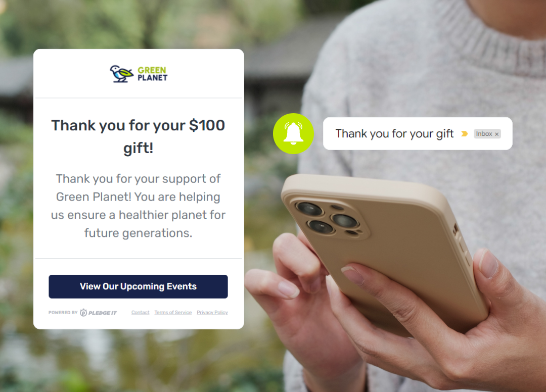
Display your donation button prominently on your website and take advantage of features like a thank-you message that appears immediately after donating, custom receipts, and a redirect button to send donors to a mission-oriented page after making their gift. Test your donation experience on multiple devices to ensure the process is fast and easy.

Every touchpoint matters on your donation form. Don’t overlook the power of your redirect button to engage donors and be sure to customize your automated donation receipt.
An effective donation form is more than just functional—it’s a tool to inspire action, build trust, and deepen your relationship with supporters. Don’t overcomplicate the donation experience with too many non-essential questions or distractions. By the time someone is visiting your donation form, they are already interested in making a gift, so use these tips to pave the way for a smooth, streamlined experience.
Looking to create a custom donation form for your organization?
Whether you’re launching a new initiative, hosting a giving day, or building a form to embed on your website, Pledge It’s custom donation forms can be created in just a few clicks. Visit your Pledge It Campaign Dashboard, select Create, and choose “Fundraise on my website” to build your next donation form or embeddable widget. If you’d like to chat about strategies or need help getting started, reach out to our Customer Success team. We’re always happy to chat!
Published on September 23, 2024
by Caitlyn Schuchhardt
Copyright ©2024 Pledge Platform Inc•Terms of Service•Privacy Policy
